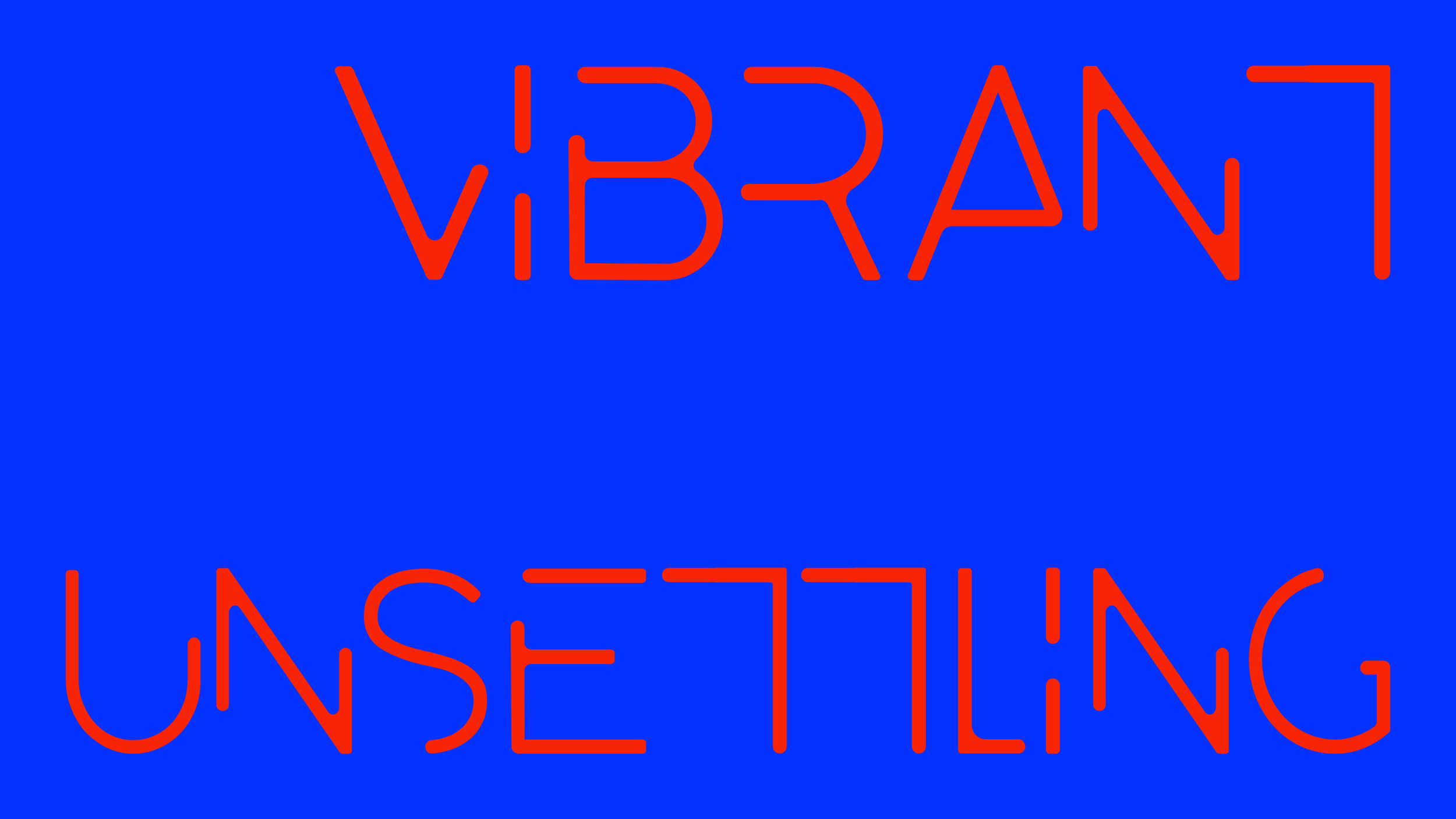
PSYCHO.
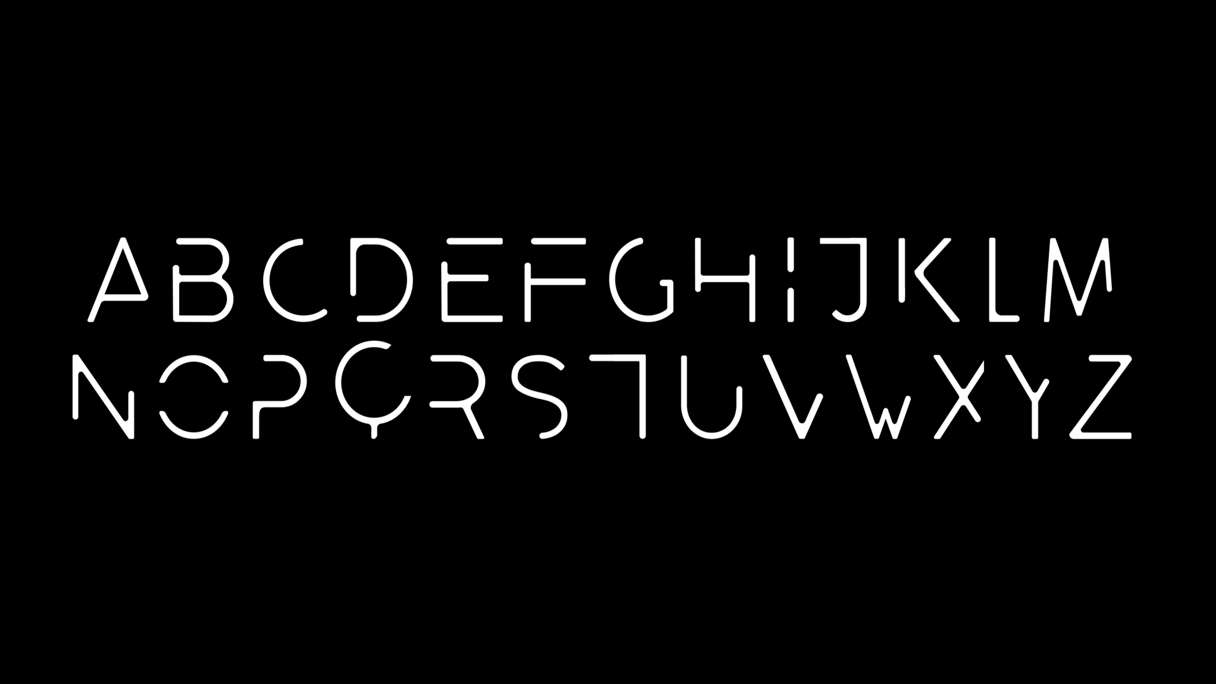
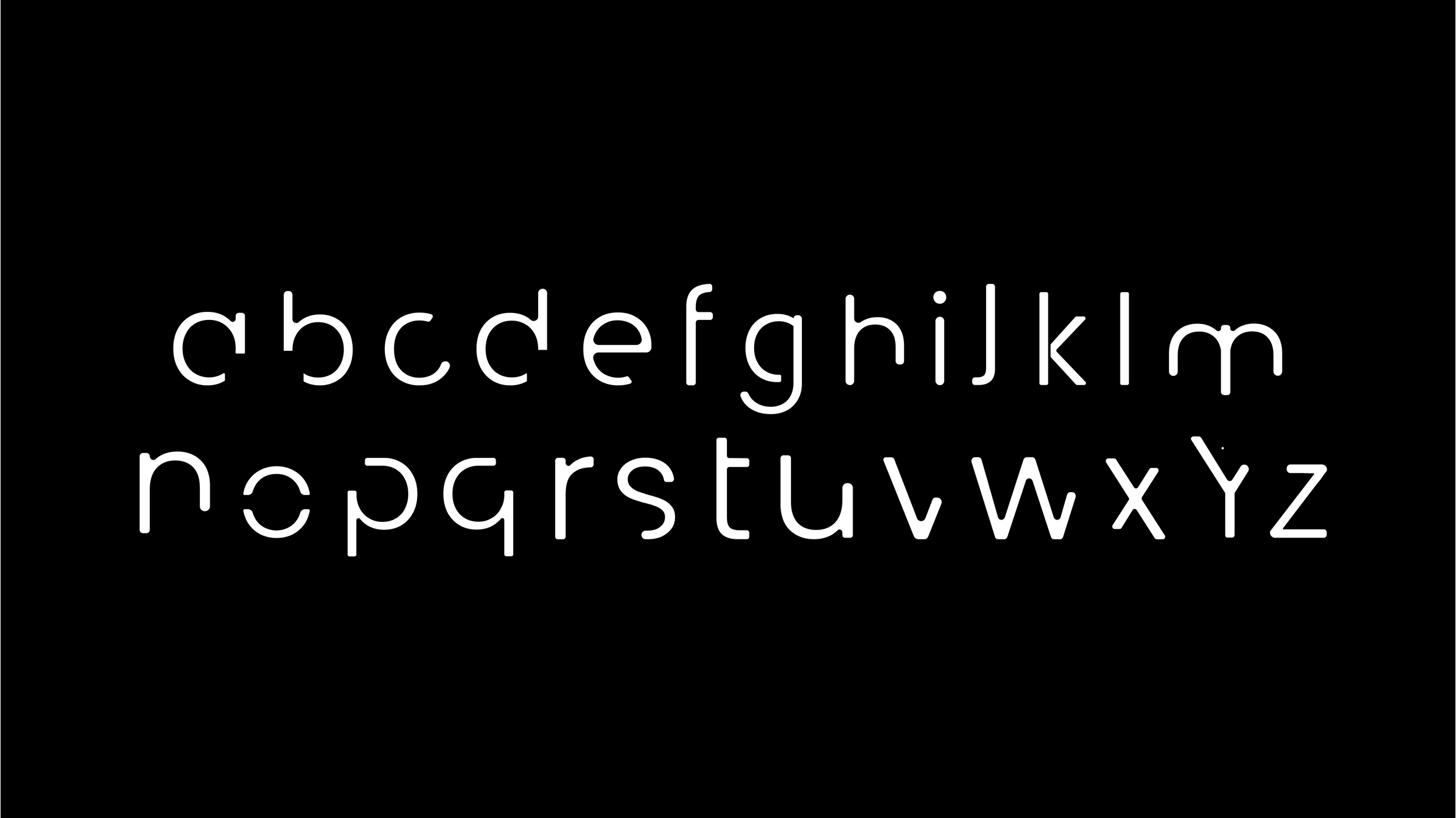
Psycho is a typeface designed to evoke disconnection and unease. Through deliberately fragmented letterforms and clashing color combinations, the typeface creates a vibrant yet unsettling visual experience that mirrors mental disarray and fractured perception, giving form to psychological states that standard typography cannot express.
controlled chaos
During the design process, I was drawn to the idea of the typeface existing in motion, carrying an almost glitchy quality.
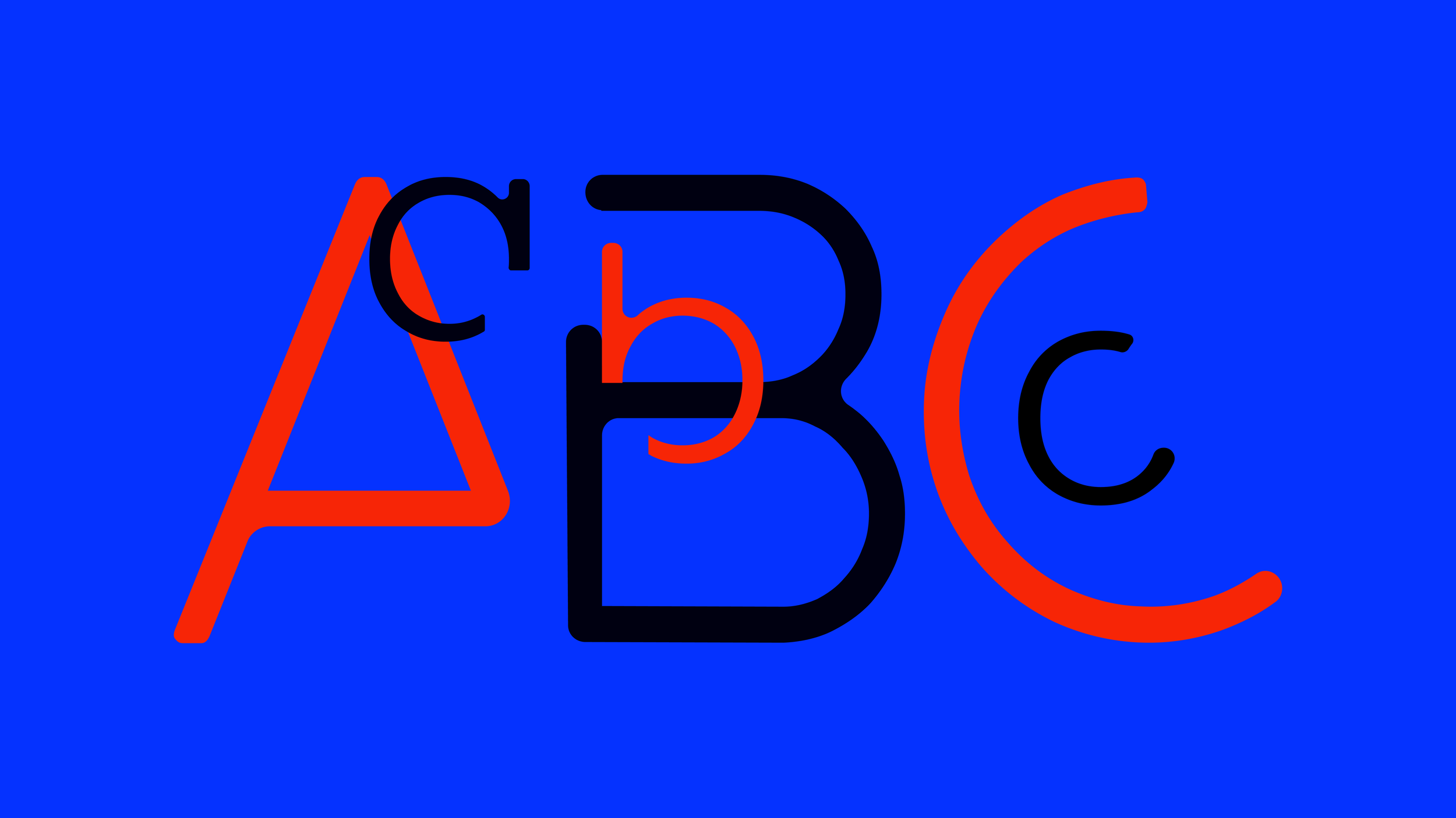
Every letter is intentionally created to evoke disconnection and unease. However, the rounded corners create soft, bouncy letterforms that establish a fascinating contrast, something feels "off," but the viewer can't quite pinpoint what, heightening the sense of psychological dissonance.
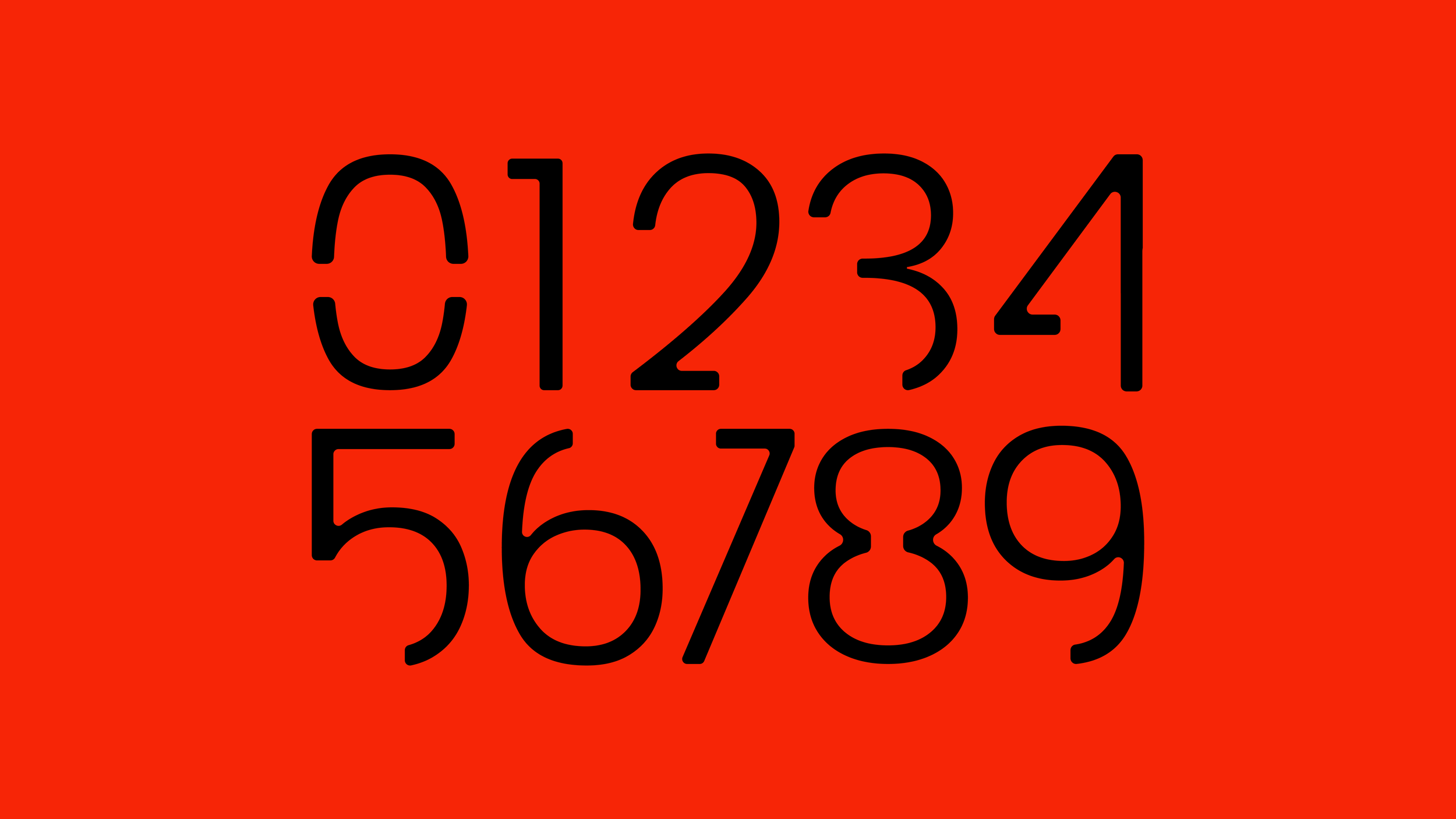
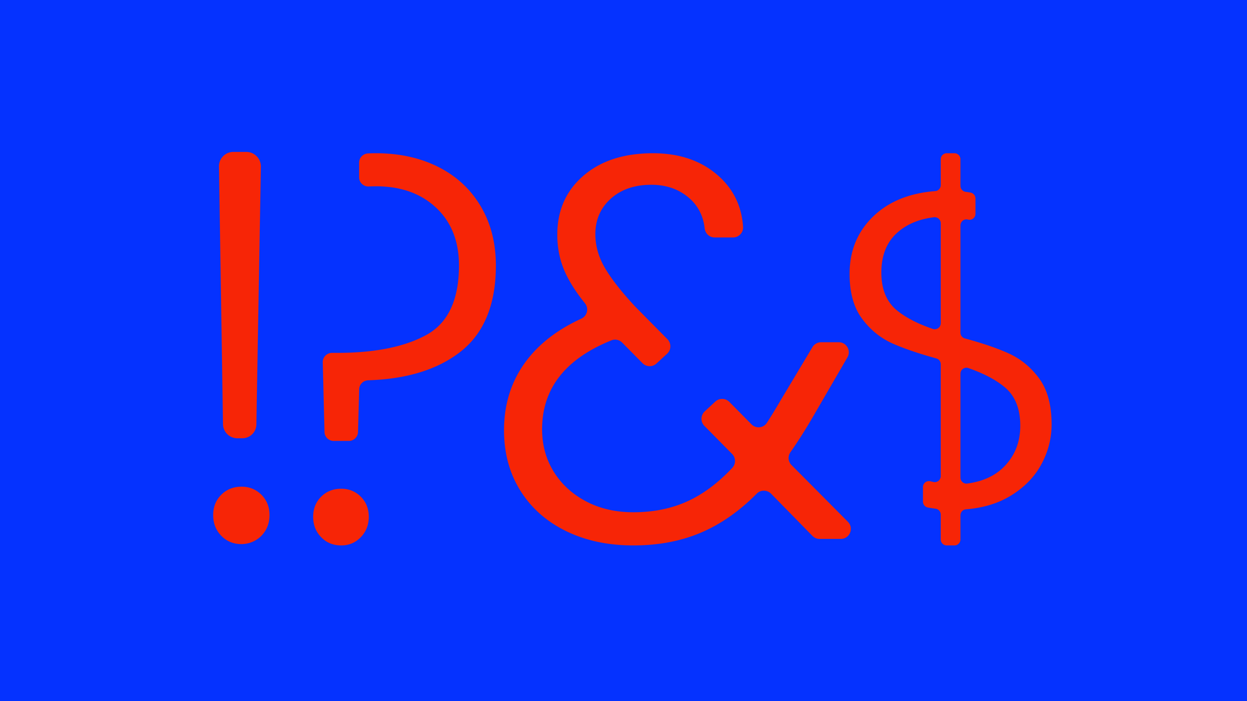
The same design principles extend to the numbers and punctuation marks below. Each character features a deliberate gap, inviting the viewer's mind to complete the missing piece, an active participation that amplifies the unsettling effect.
PYSCho: for the perfect marriage
As an example of my motion design work, I created a concept movie trailer for the novel The Perfect Marriage by Geneva Rose, imagining how it might be adapted for the screen. I chose the typeface Psycho to visually capture the sense of unease and tension that runs throughout the story.