In Sapporo, winter isn't just a season, it's a celebration. Where snow-covered peaks meet vibrant city lights and the spirit of competition burns brightest.
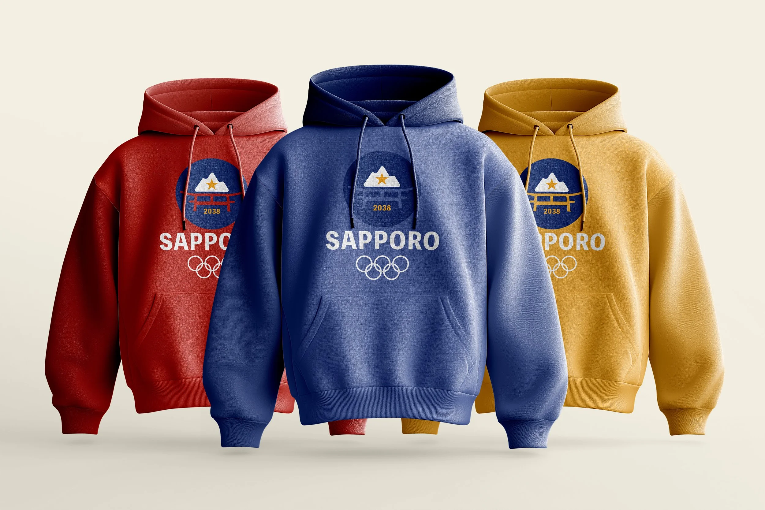
This identity features three logo variations, each evoking a distinct mood of Sapporo: the brightness of its culture, the prestige of a gold medal, and the calm, cool tones of a Sapporo winter.
To create a design rooted in Sapporo's culture while remaining accessible to a global audience, I used Japanese kanji—specifically characters representing sports-related words—as foundational graphic elements and patterns throughout the identity, bridging cultural authenticity with universal visual language.
BRAND IDENTITY - PACKAGE DESIGN - ADVERTISEMENTS - ENVIRONMENTAL DESIGN
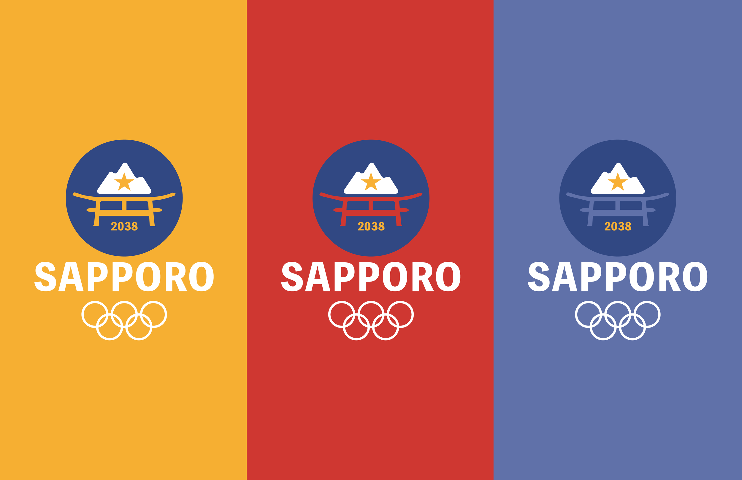
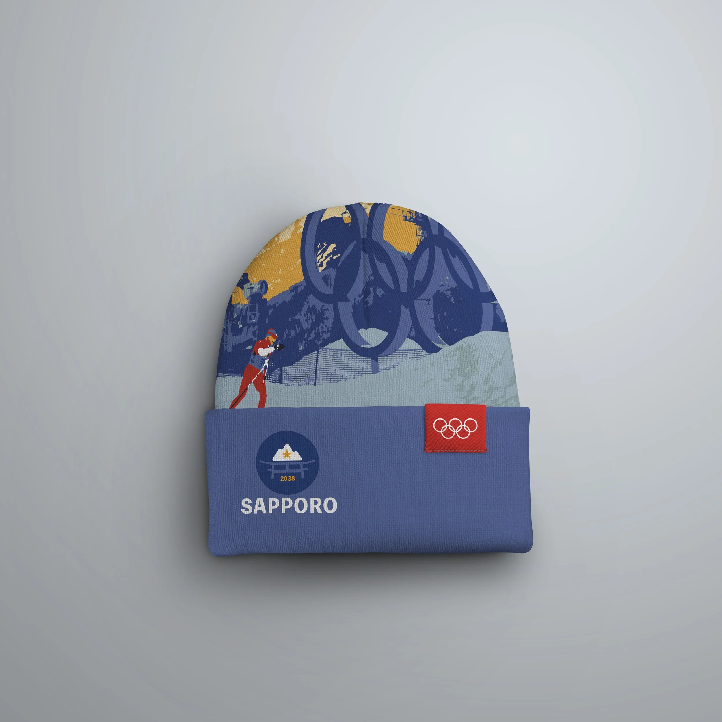
This brand identity system features three distinct logos used consistently across all deliverables. Each logo incorporates symbolic elements: the torii gates of Japan, the snow-capped mountains of Sapporo, and the iconic Sapporo star. The color palette is equally intentional—yellow/gold symbolizes the gold medal, blue evokes the winter setting, and red celebrates Sapporo's rich cultural heritage.
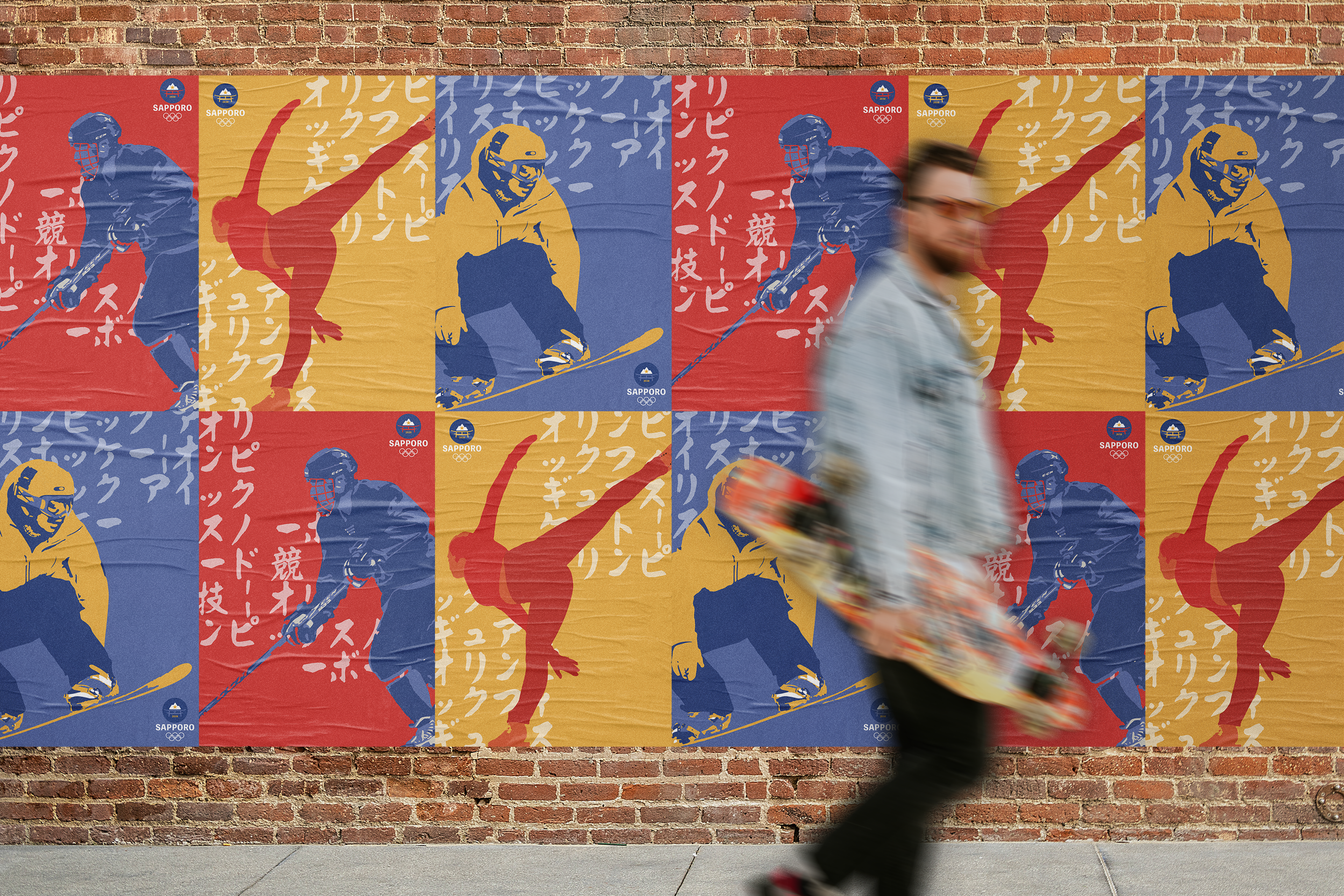
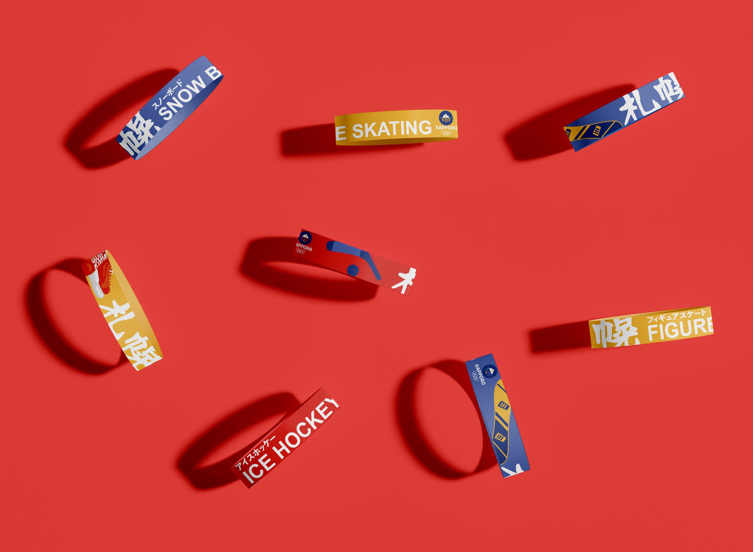
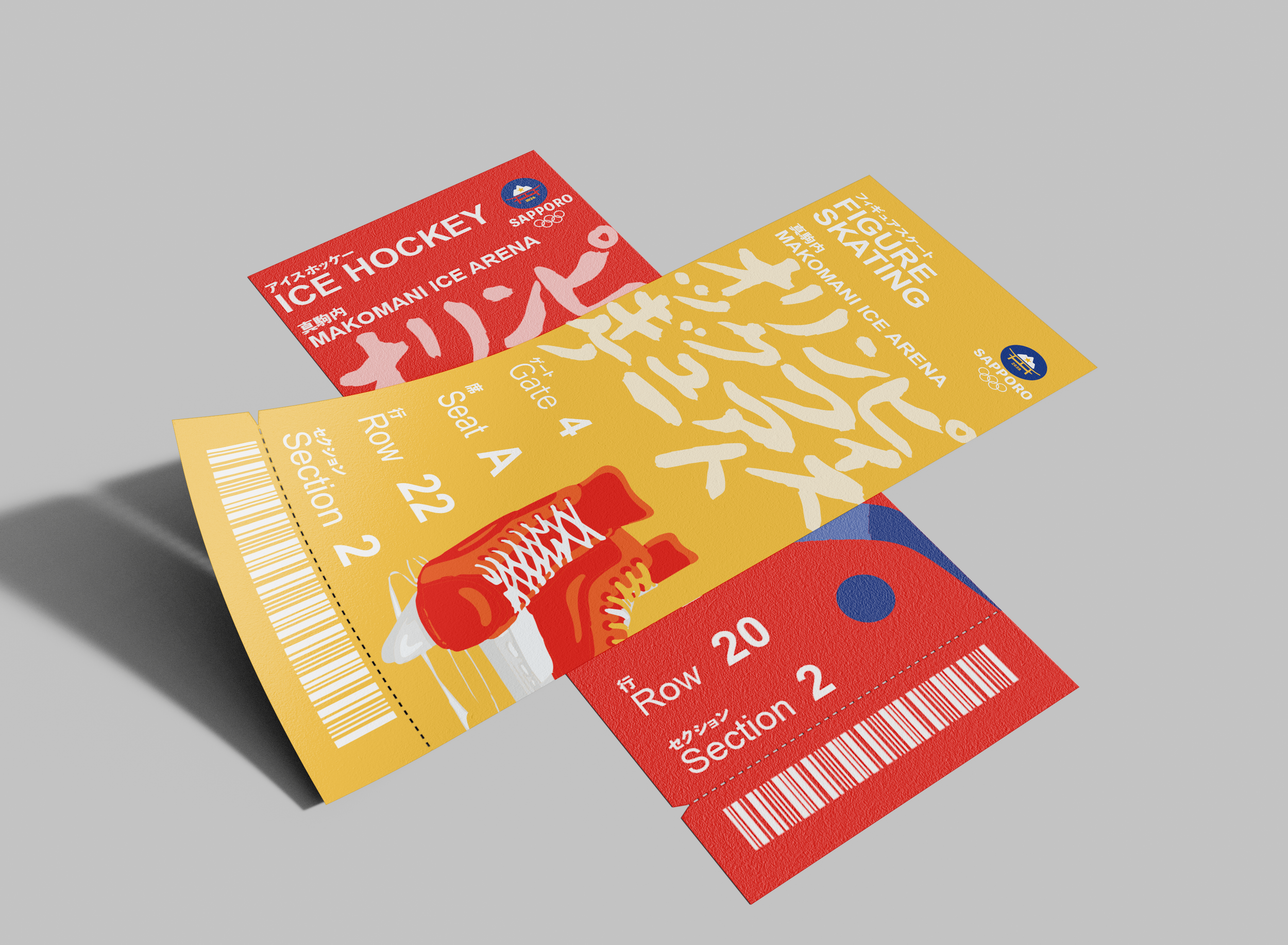
The three banners establish a cohesive visual system representing snowboarding, figure skating, and ice hockey, with each sport distinguished by its own signature color. The design emphasizes the athletes themselves while incorporating Japanese kanji as a pattern element that guides the viewer's eye from one poster to the next. This distinctive approach carries through consistently across all remaining deliverables.
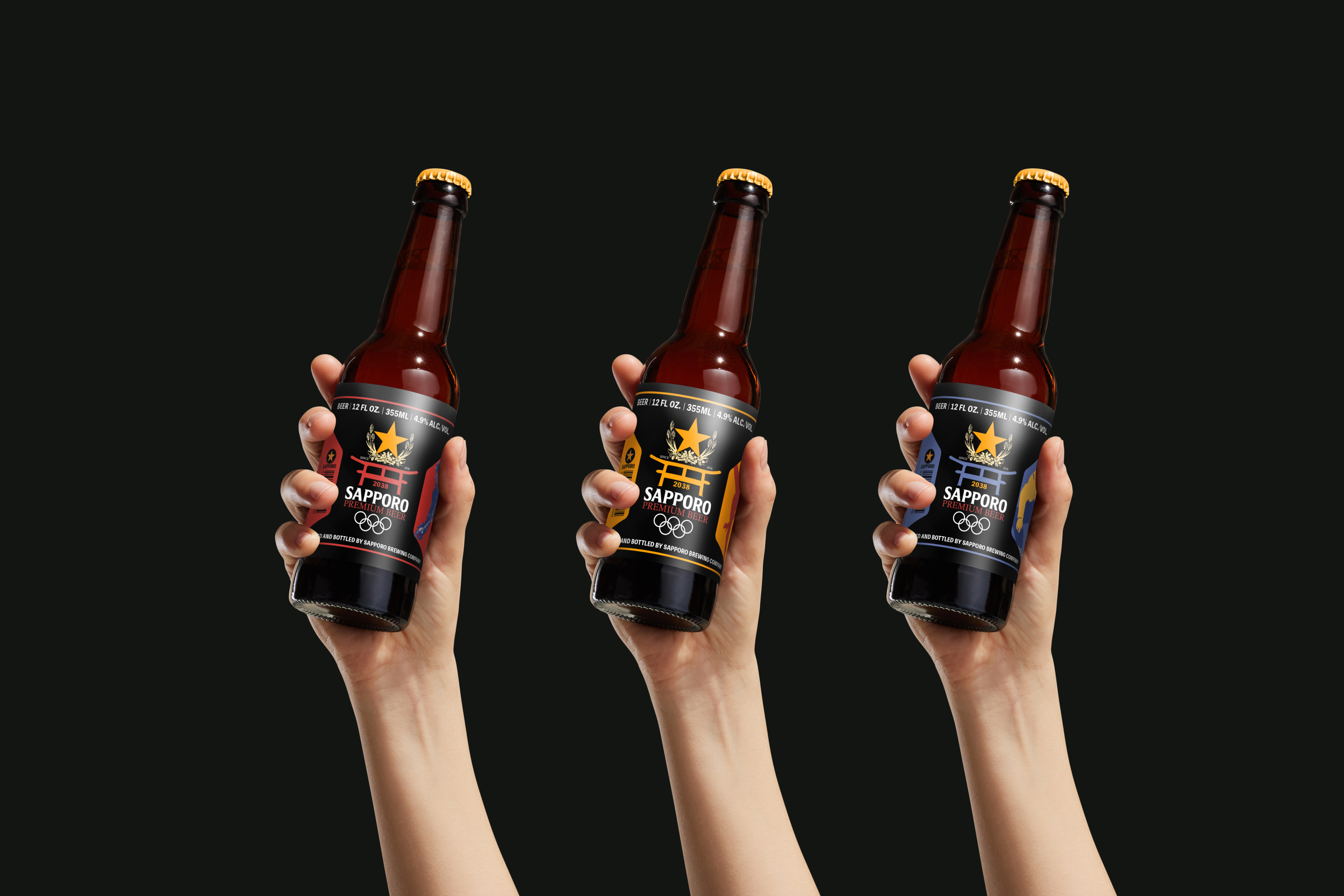
For the Sapporo Olympics, I envisioned an engaging brand collaboration with the iconic Sapporo Beer company to create commemorative keepsakes for spectators enjoying beverages during events. I merged the Sapporo Winter Olympics logo with the Sapporo Beer branding and incorporated each sport's unique identity onto individual bottles, resulting in collectible Olympic memorabilia that audiences could take home as lasting mementos of the experience.
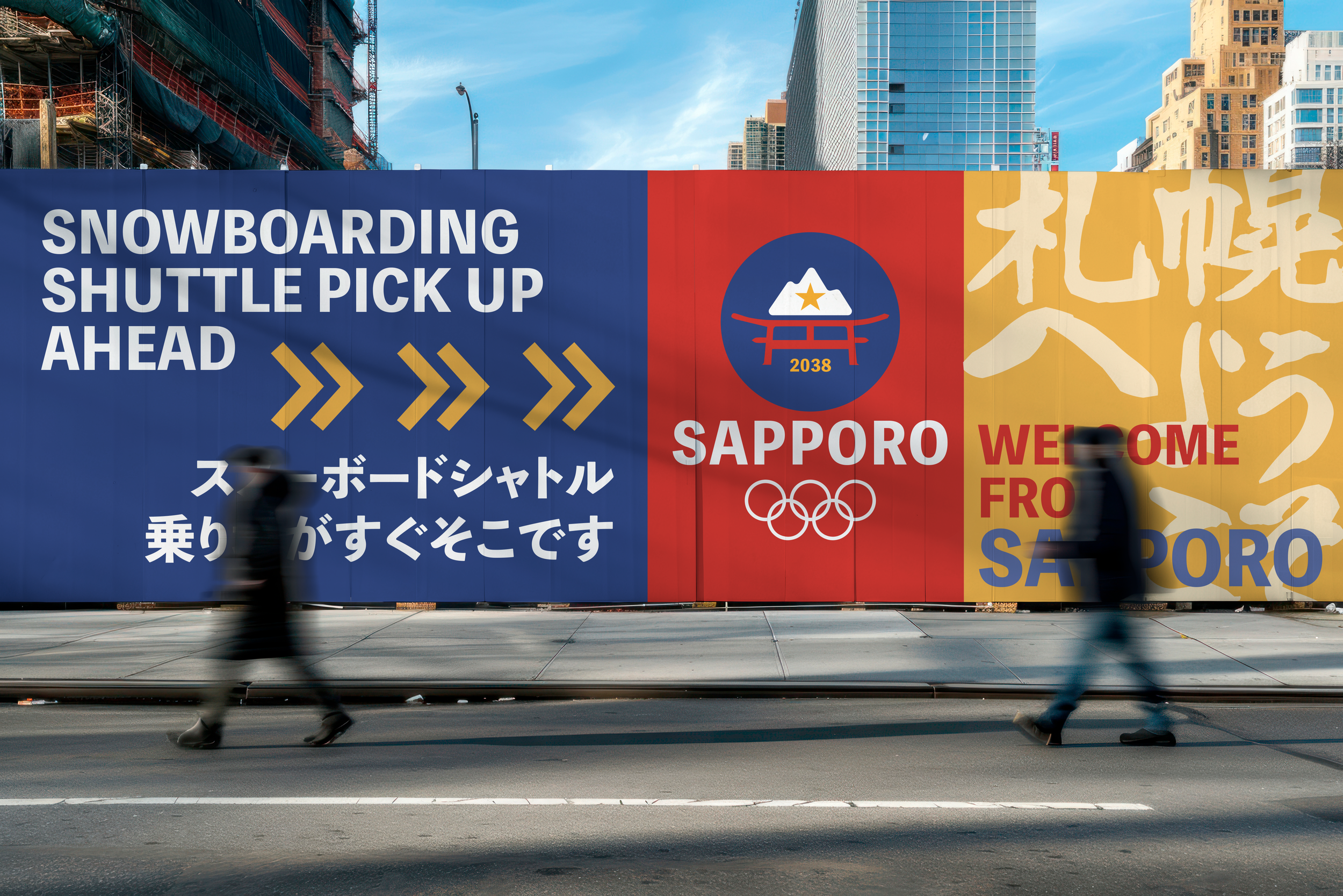
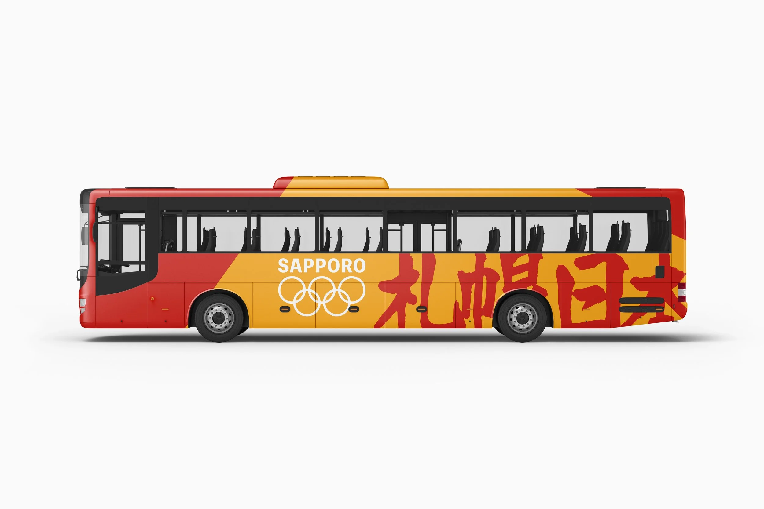
Effective wayfinding is essential, as is maintaining the bold, vibrant branding throughout. The signage was designed to be clear, highly visible, and straightforward, ensuring that both international visitors and local attendees can navigate effortlessly.
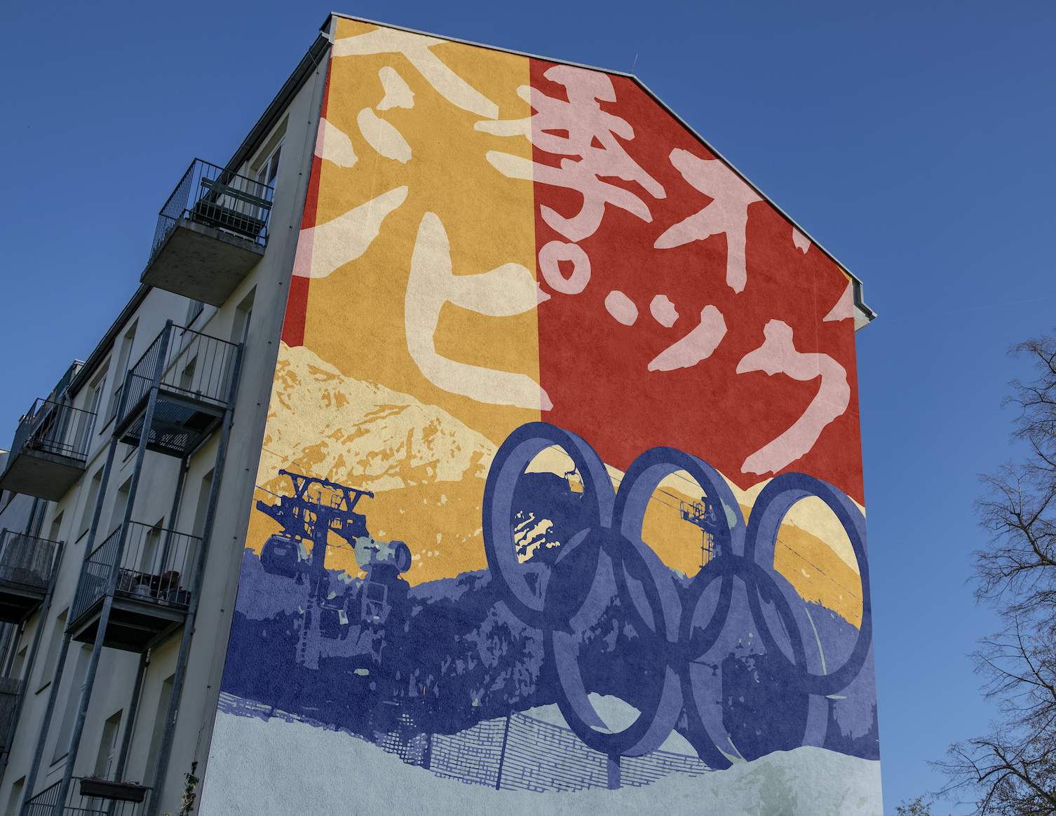
While environmental signage serves an essential wayfinding purpose, I wanted to create something that goes beyond mere information—a memorable photo opportunity. In today's social media-driven culture, people naturally gravitate toward shareable moments, and this mural was designed with that behavior in mind. Maintaining the established style and color palette of the brand identity while incorporating kanji, the mural invites spectators to capture and share their Olympic experience.
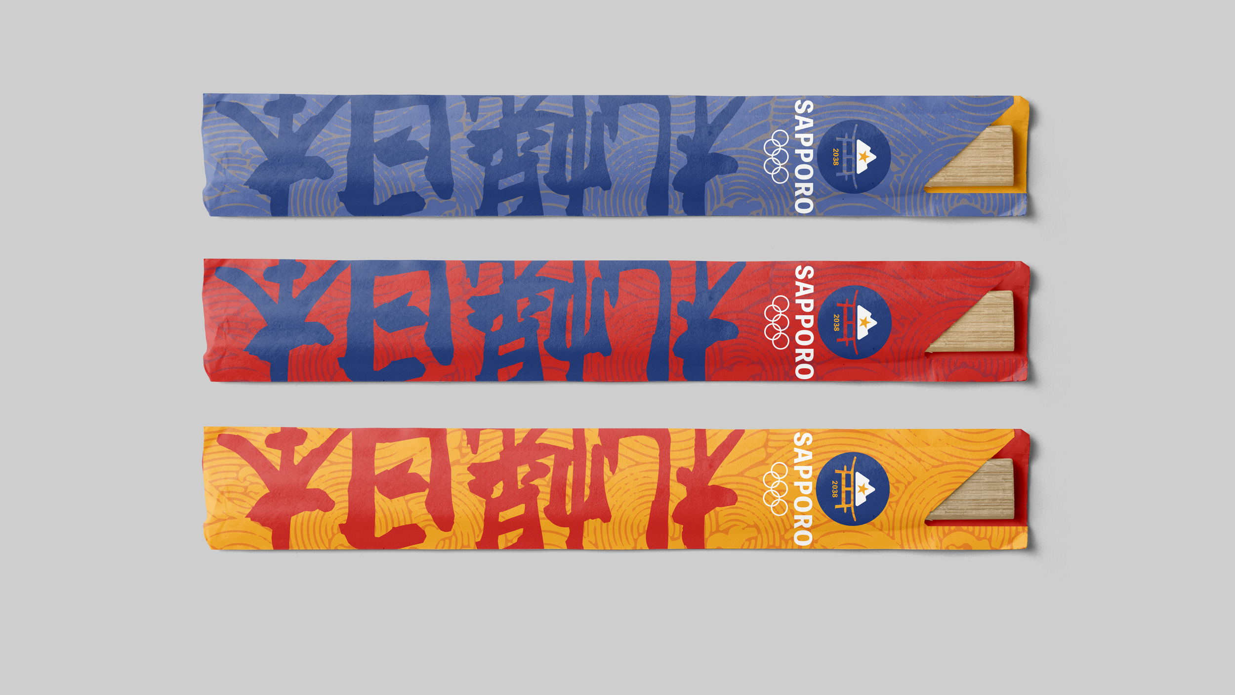
Similar to the Sapporo beer bottle collaboration, I aimed to create another culturally resonant keepsake that attendees would receive when ordering food at the games. In Japan, chopsticks hold sacred significance—they symbolize a bridge between humans and the divine, as well as connections between people, and are traditionally gifted to represent longevity and happiness. Honoring and preserving this cultural tradition felt essential to the overall experience.